After using the Gympass app for a few months (benefit given to Yampi employees, a company I work and love), I decided to reread some of the app’s menus as a way of studying and training.
It is important to point out, first of all, that after working on projects we understand that often the dispositions of information within a platform go far beyond Ux and Ui, but involve business, priorities and perhaps the version I am seeing is even a test AB It is also important to point out that I do not consider my notes to be an absolute truth, that the analyzes made here have a more direct and shallow tone, when compared to the product context, where each change requires much greater attention and context than what was done next. .
About Menu
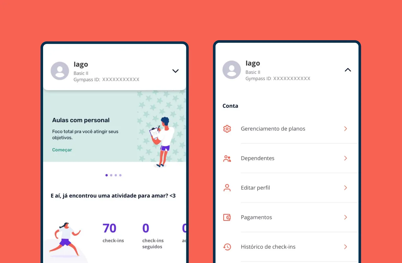
The Gympass application has a menu of options and information that can be accessed by pressing the arrow in the upper right corner, when pressed, the menu overlaps the entire screen with these options.
In general, this menu would not be a problem in my opinion, however, as I observed in an analysis of the Apple Store and Google Store bad rates, many problems revolve around the application’s interface, which mixes different contents in their arrangement (I will explain later) so, within my understanding and study, I decided to change it so as not to cause more confusion and bring more familiarity.
About Illustrations.
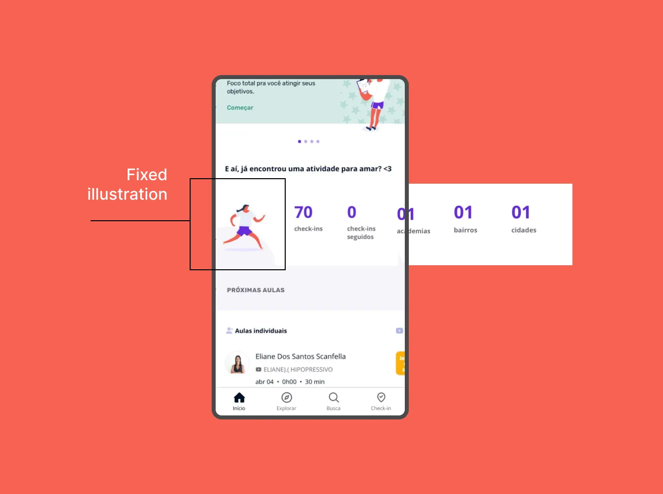
In one of the first sections of the Home menu, there is a section that shows how many check-ins you’ve done, how many gyms you’ve been to, how many cities and some other really cool information.
The point that I didn’t find interesting here is that the content of this section is not shown in full, requiring the user to scroll sideways to view all the content, while an illustration (fixed on the screen) occupies 35% of the view. OBS: I’m not reducing the importance of flat illustrations, I particularly like it and I think it’s a great tool to convey the brand identity, I even think Gympass’s are very beautiful, I’m just talking about the positioning of the same.
About titles and space.
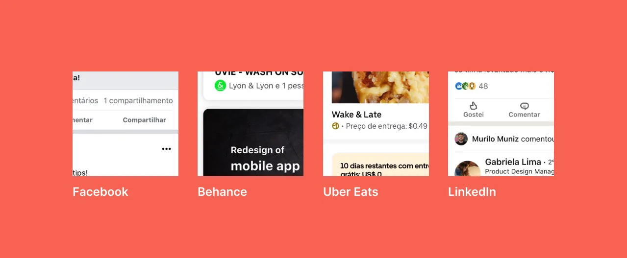
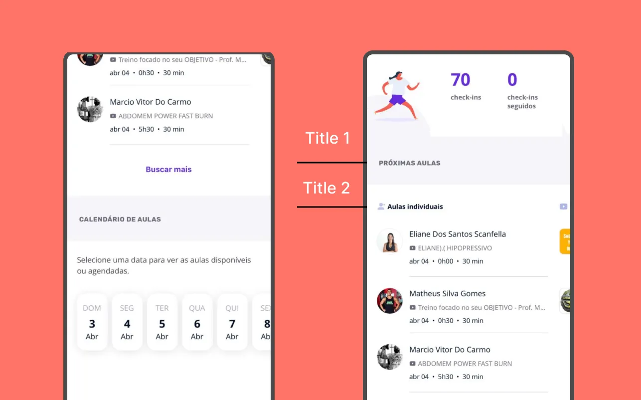
Generally, from what I’ve seen, sections within a page in apps use white color as the sections color and gray as a general background so when a section ends, a gray stripe of background divides it.
Of course this is not a rule, applications have different identities and colors, in addition to night themes or several themes within the same application, I’m punctuating this common behavior, because I think Gympass’s intention was to follow this same pattern.
About line breaks and little text.
The application demonstrates an effort to limit descriptions to one line in several situations, limiting texts that could be important for the user’s decision making to three or four words that could become longer sentences if treated with due attention. Let’s look at an example:
In one of the last sections of the Home, Gympass shows you the apps available in your plan, however, within such a large space, the information about the first app is limited to a sentence cut in half (there is no lack of space).
Of course, when clicking on the app, the user sees a more complete description of the app, but with such a small sentence, he can’t even imagine what it’s about.
Is it online or not?
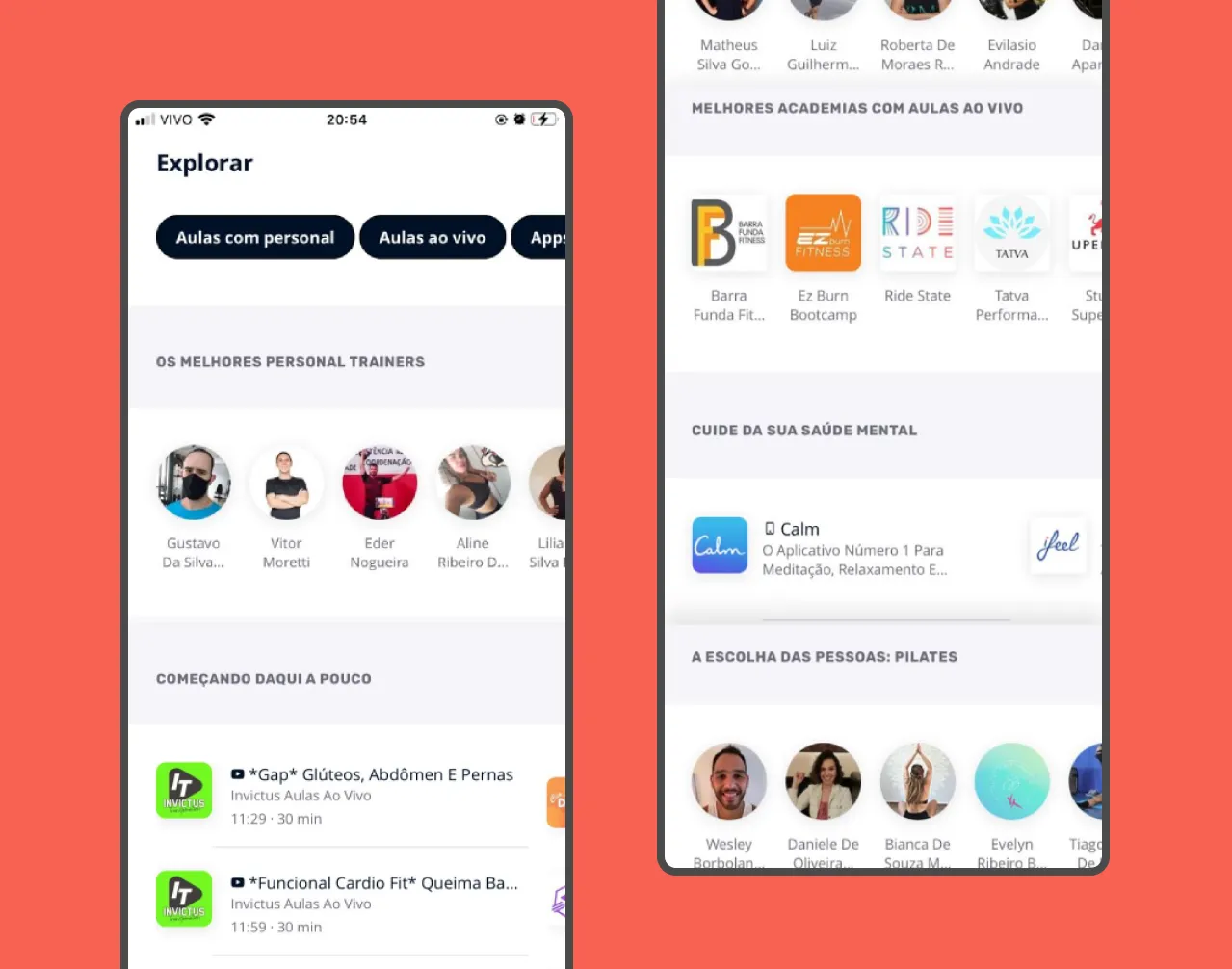
Within the explore menu, the user will find a lot of information about personals, yoga classes, pilates, functional training, available applications divided into different categories, classes that will start soon.
As briefly mentioned earlier, many complaints about the app in the Store are related to the mess around the available content, difficulty checking in and finding the gyms.
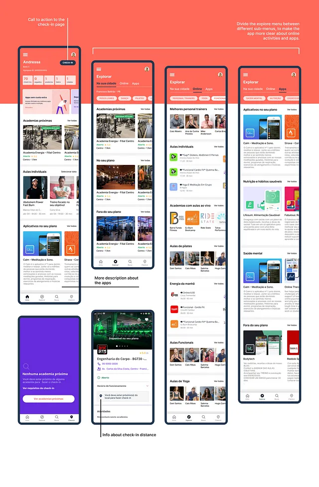
I believe that all this information mixed up on this screen, without titles informing whether classes, personals and training are all online or available in my city, ends up creating more confusion for the user.
Lack of clarification..
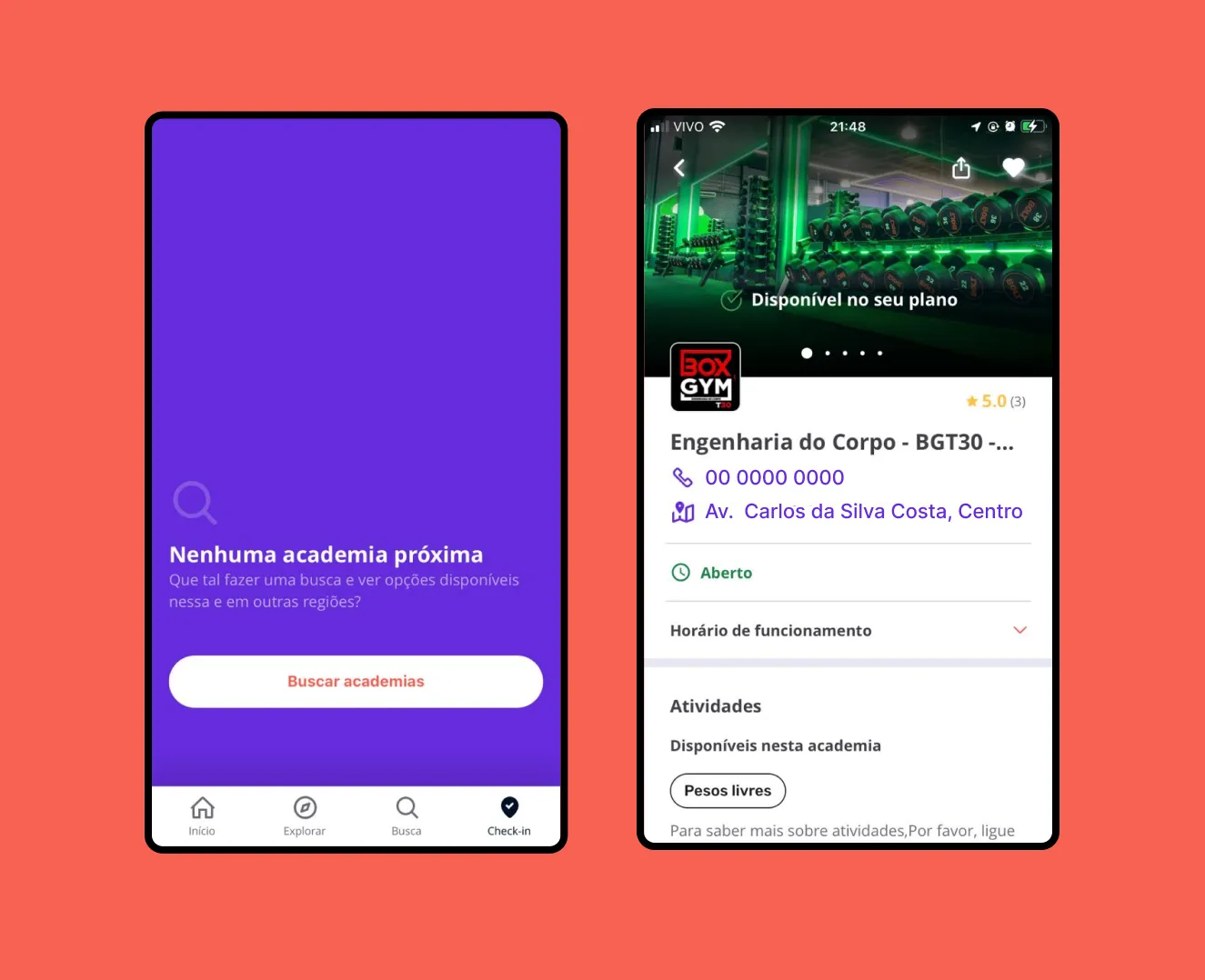
Gympass requires the user to be 200 meters from the gym to check in, so for a gym to appear within the check-in section of the app, it must be within the 200 m range. Knowing this, I encountered some problems in this section:
Knowing this, I encountered some problems in this section:
1º How can the user know that he must be close to the gym to check-in?
2º How does the user know how close to the gym he must be to check-in?
3º The “search gyms” button implies that after doing the search, the user will be able to check-in, which does not happen, because when clicking on the button and finding the gym of interest, it does not provide any information about check-in. .
Design suggestions
